Important Lessons on Design for Manufacture with Ray Wills: The Making of the Building Better Futures for Health Challenge Trophy
“Being able to take that industry standard material and produce something quite beautiful out of it was really satisfying”
It’s almost time to kick off this year’s Building Better Futures for Health Challenge and we’re eagerly looking forward to discovering your idea that could make a difference to people’s health. To get the inspiration flowing, we spoke to IDE Product Developer, Ray Wills for some fun insight into the making of the BBFH Challenge winner’s trophy.
IDE Connect (IC): What was the process you took to come up with the design?
Ray Wills (RW): We had a pretty short turnaround time for this project which is always a great challenge. In order to stay true to our values we had to distil our ideation approach. We established quite early on that we wanted our brand identity to be part of the form as opposed to applied to the form as a plaque or other kind of ‘label’. Then we established the scale and did some exploration and fine tuning to come to the final design.
IC: What was your rationale for the final design?
RW: Since a trophy is intended to be an eye catching object I really wanted to stay close to the value IDE brings to physical products. I kept coming back to how we approach design for manufacture and one of the perspectives we employ is to look for opportunities within the constraints of each material.
I think that approach speaks for itself in the final design because designing for manufacture is deeply embedded in our daily processes at IDE. That means being honest with our material choices and staying true to their intended purpose or use. It also means making sure we’re working with the manufacturing process rather than fighting it. Try to use materials in ways that they’re good at, rather than forcing plastic to do something metal should be doing and vice versa.

IC: How did you select the materials?
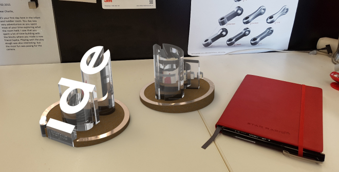
RW: The final design included a bronze base and PMMA (Perspex) letters in the form of 3 pillars. While bronze isn’t something we would use on a day to day basis it is representative of learning, understanding and working with new materials. From that perspective it held a lot of meaning and value to us.
PMMA is a common plastic that is great for clear parts. The fact that it is a standard industry plastic was also one of the reasons why we chose it. Being able to take that industry standard material and produce something quite beautiful out of it was really satisfying.
We applied surface treatments to both of the materials to give them different textures and add life to the design without introducing extra parts. The bronze includes polished and matte finishes. These offset the surfaces and let us bring out the different forms that play a role in our logo without changing the materials or colours.
Similarly, with the Perspex, we polished it to produce a glass-like effect. The cut letters were then sandblasted to avoid having to paint, coat or add a different material. With just these two materials we were able to end up with four very distinct surface finishes.
IC: What was the key takeaway from the experience?
RW: Treating this project like a short lead time prototype meant we didn’t have the opportunity to test some fits and alignment. To resolve this, we designed tolerances into the trophies to allow us to fine tune them once they arrived if necessary. For this particular project, fixing small issues on site was much easier than trying to resolve all of the issues before we sent it off to manufacture and letting it hold up the whole project.
This is a good lesson for prototyping. Just be clear about what you want to learn or test in your design. Then you can learn so much more about your design if you can resolve or accept other issues in a much shorter time frame.